ᨒ
Adventure Unknown
Case Study

Adventure Unknown: How Letting Members Tell the Story Gave St. Louis’ Most Unique Club a Voice and a Brand
Adventure Unknown is hard to describe, because it’s different things to different people. That’s exactly why we let the members do the talking.
-Tony Mellinger
Client Snapshot and Challenge
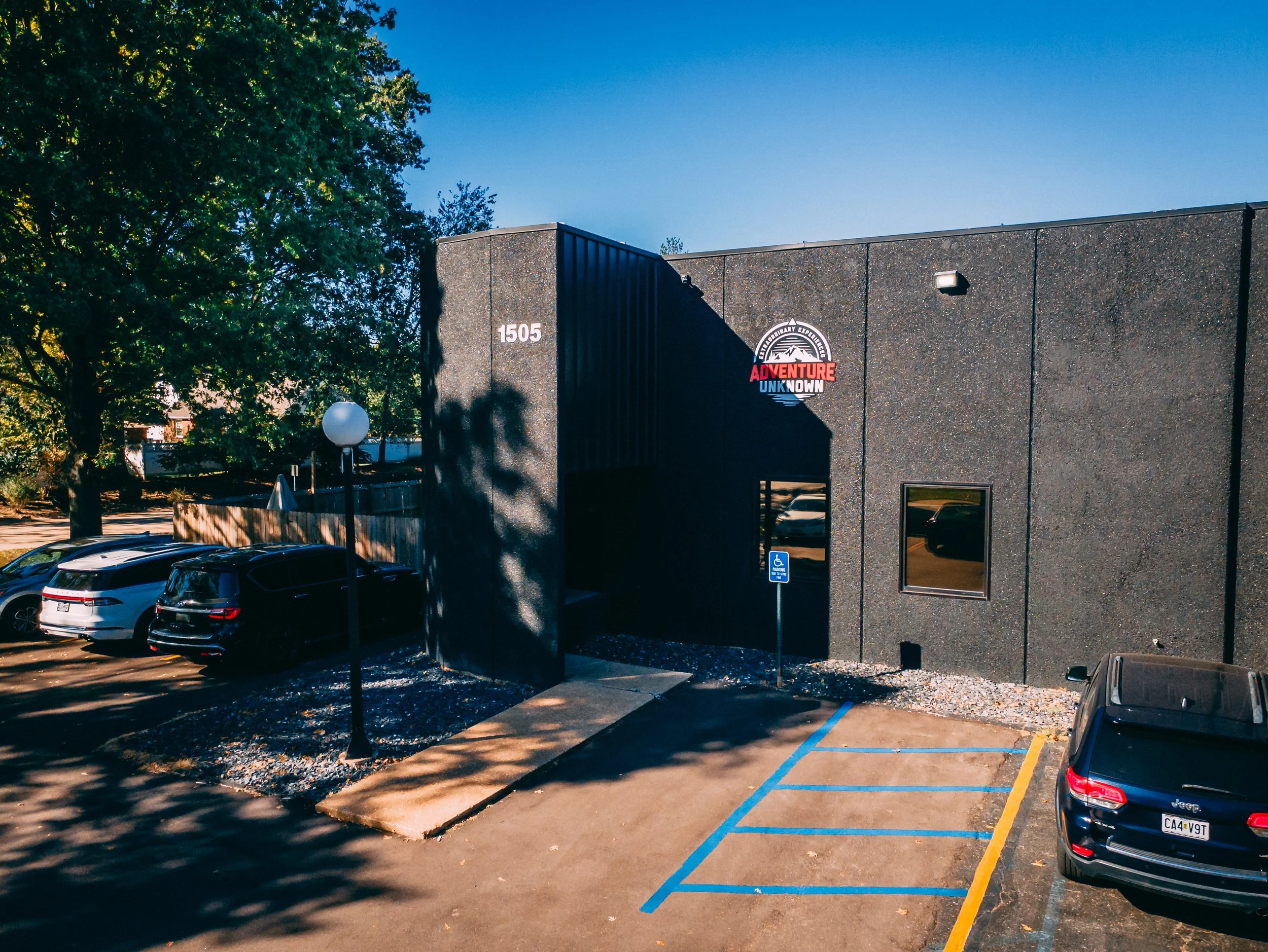
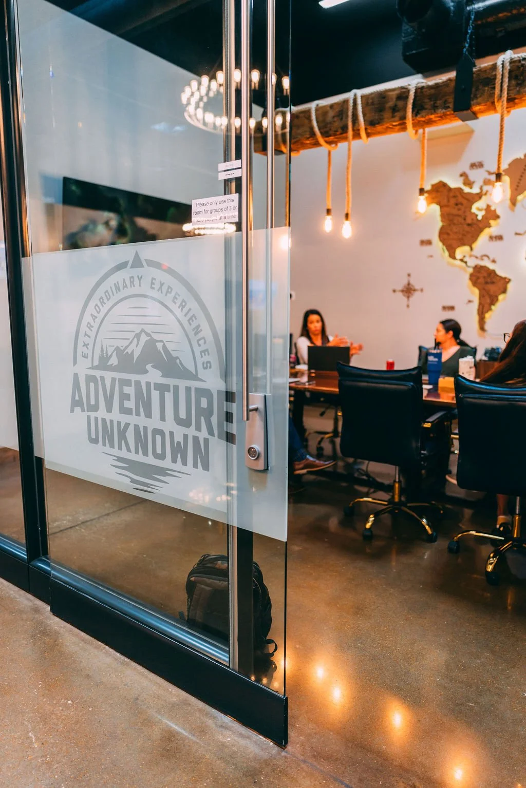
Adventure Unknown is a private business and travel club based in Fenton, Missouri, just outside St. Louis. Founded by Scott and Johanna Schuessler, Adventure Unknown blends professional coworking spaces, executive offices, conference rooms, fitness and wellness amenities, social events, and curated travel experiences into a single membership.

Adventure Unknown is intentionally positioned as a premium club. Members are investing into a membership that promises elevated experiences, meaningful networking, and thoughtfully-curated travel experiences.
But it was evident when we met Adventure Unknown that not every touchpoint felt as intentional and high-end as their in-person experiences.
So we set out to elevate their brand through digital channels and overhaul their member communication systems.
Why the brand experience mattered so much
What was the challenge we set out to tackle?
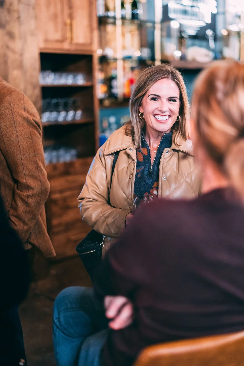
Adventure Unknown does not fit neatly into one category. Some members join for the coworking space. Others for the trips. Others for weekly networking and community events. The club means different things to different people, and there was no simple, shared way to explain it.
Social media content had grown into a mix of graphics and photos with no cohesive visual identity, no consistent fonts, and no recurring content theme. Posts felt one off instead of part of a clear brand story.
With a full calendar of trips, events, and activities, communication often tried to cover everything at once. That made it harder for members and prospects to see what was most important for them, and easy for key messages to get lost.
The website used inconsistent fonts and mixed photography styles, and it lacked a flagship piece of visual content that showed what being part of Adventure Unknown really feels like.
Goals and Success Metrics
When Scott and Johanna partnered with Aspen Creative Co., we aligned on four core goals.
Give Adventure Unknown a repeatable, human way to answer the question “What is Adventure Unknown?” that works for different types of prospects.
Build a consistent, member-first visual identity on social media that reflects the quality and energy of the club.
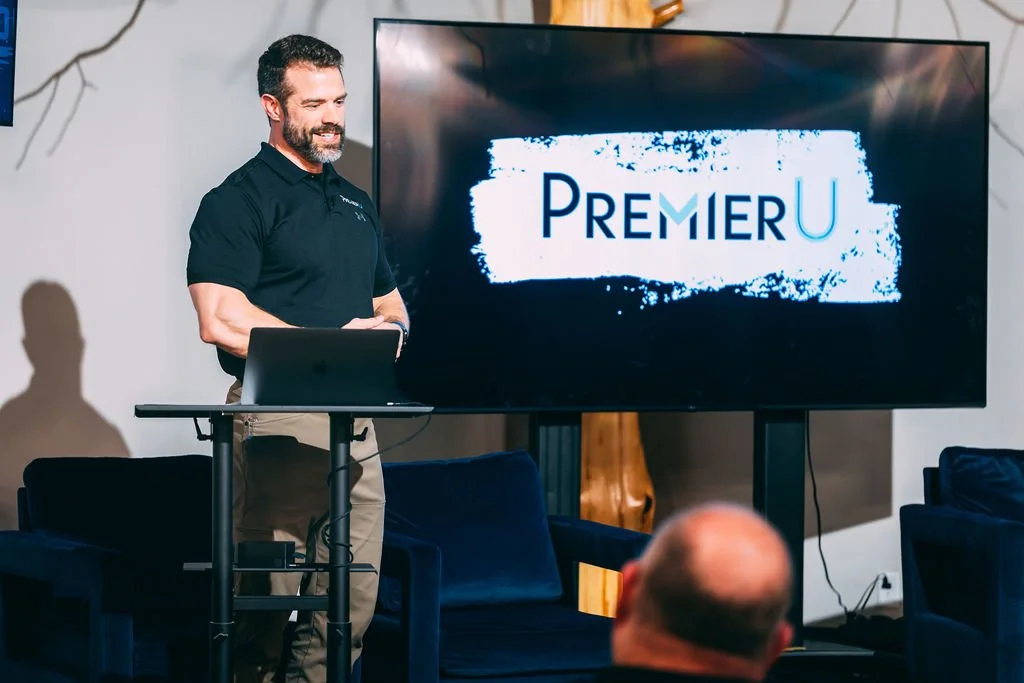
Make email communication clearer and more engaging by separating travel content from other club news and by upgrading the main weekly email into a branded, professional communication.
Anchor the website with a looping highlight video that shows Adventure Unknown in action, helping visitors quickly decide if the club is right for them.
Strategy: The Aspen Creative Co. Approach
Let members answer “What is Adventure Unknown?”
Adventure Unknown is intentionally multi-dimensional. They had struggled in the past with other marketing companies who tried to force them to develop a single elevator pitch to sum up who they are in one, carefully crafted line. But every option brought to the table, fell short of fully describing the depth of Adventure Unknown.
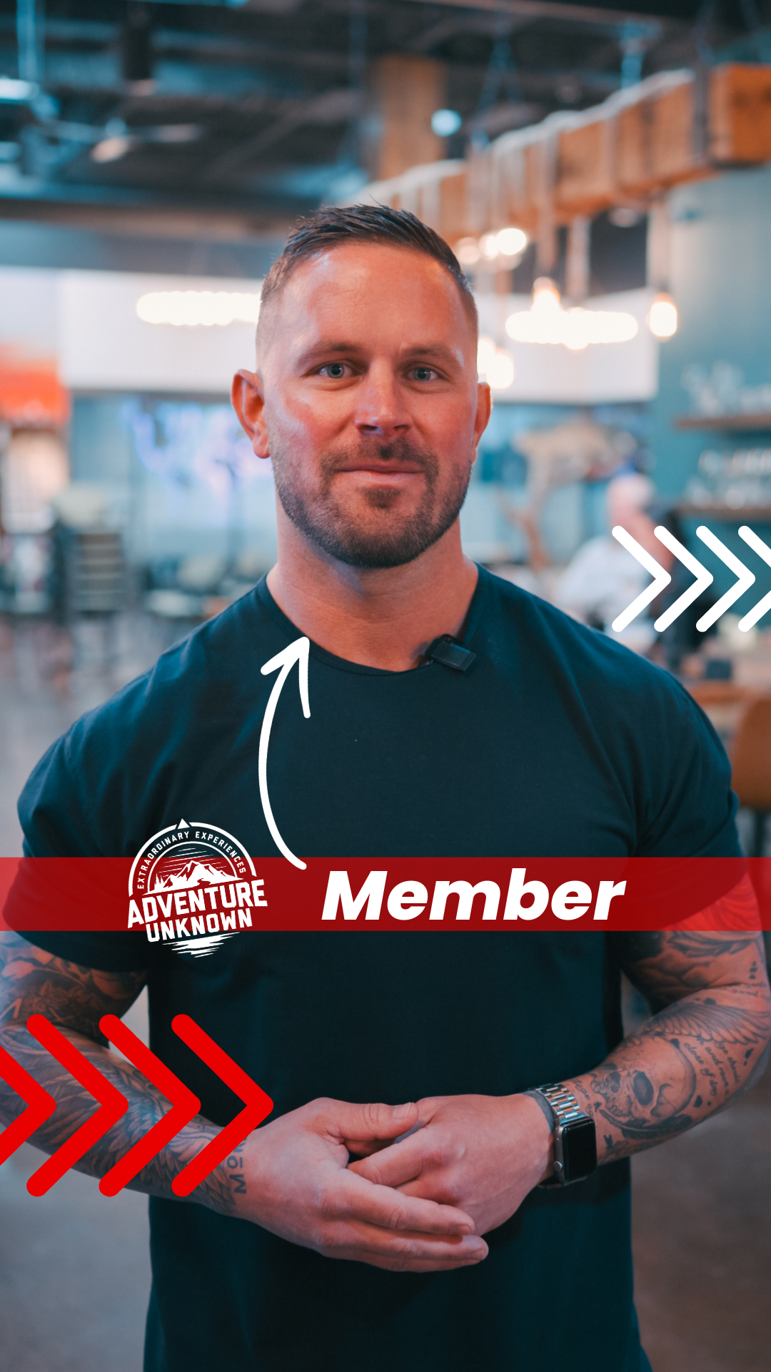
Instead, we listened to their challenges, and decided together that a single, flashy one-liner might work for some brands, but not for them. Instead we knew we needed a content strategy that could tell a fuller-picture. We decided there would be no better way to tell the story of Adventure Unknown than through the voices of their members.
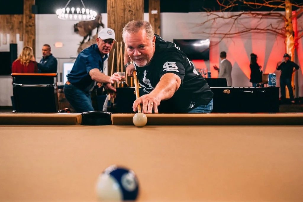
In our first couple weeks together, we captured over 25 members on video, asking a simple question, “What is Adventure Unknown to you?”
Some members described it as “my second office”. Others saw it as “where I have met my closest friends”. Others focus on “the only way I have managed to take multiple international trips while running a business”.
That range of answers began to shape the true multi-faceted value of the club far better than a single line of copy ever could.

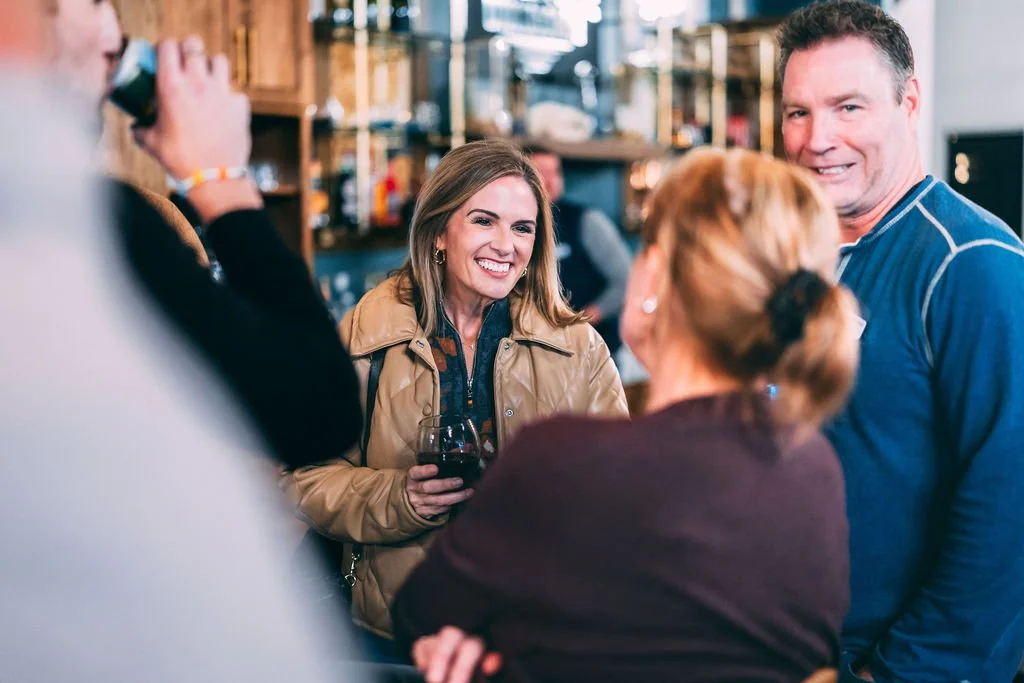
Turn members into the visual identity
We moved Adventure Unknown away from a patchwork of graphics and stock images and toward a system where members themselves are the face of the brand. Every piece of social content is built around real people, real spaces, and real moments at the club, all presented with a consistent set of fonts, colors, and layouts.

Before Aspen Creative Co., travel announcements and club event updates were often bundled together. That made it hard for members to quickly see what applied to them and added to inbox fatigue. We made two key changes.
Launched a dedicated weekly travel email that is primarily educational, not just promotional.
-Topics include “how to eat like a local (not a tourist)” and “why travel is better than therapy”.
-Travel offers and calls to action come after value-driven content, which encourages higher opens and ongoing engagement.
Rebuilt the regular weekly club email as a branded, consistent communication.
-Gave it a clear subject line, a consistent layout, and branded typography and colors so members know exactly what to expect.
-Standardized sections so readers can scan quickly and never feel overwhelmed.
This combination separated travel information from general club communication and made both emails more useful and more professional in the inbox, which is especially important for a higher-priced membership where every touchpoint signals value.
Separate travel email from club email and upgrade both
Visuals that shows the club in motion
To give the website a strong first impression, Aspen Creative Co. produced a looping highlight video for the homepage. The video shows members working, networking, laughing, and traveling together. Someone visiting the site now gets a feel for the club within seconds instead of needing to read multiple pages of copy.
Execution: What We Actually Did
Discovery and positioning
Held working sessions with Scott and Johanna to map out the full member journey, from first impression to trips taken.
Identified that member stories, not abstract benefits, were the clearest way to communicate what Adventure Unknown offers.
Member testimonial video series
Planned and filmed a series of short testimonial videos where members answer, “What is Adventure Unknown to you?”
Edited clips into social posts for Instagram and Facebook, each focused on one member’s perspective.
Member-first social media system
Established a consistent set of fonts, colors, and design rules for content featuring members, events, and trips.
Shifted posting from irregular, mismatched content to a steady cadence where each post reinforces the core brand story.
Two-stream email strategy and redesign
Designed the weekly travel email as a simple, story led format that offers tips, perspectives, and ideas about travel, followed by relevant trips.
Reworked the main weekly club email with a recognizable header, sections, and sign-offs so it feels like a professional publication rather than a one-off notice.
Homepage brand video production
Captured footage of members using the workspace, attending events, and enjoying the club amenities and travel experiences.
Edited a flagship brand video for the homepage that can also be repurposed across social media and sales conversations.
Ongoing communication strategy support
Worked with the Adventure Unknown team to prioritize which events and initiatives deserve spotlight treatment and which can sit behind the scenes.
Provided guidance on how to keep future communications focused, clear, and member-first.
Results: The Measurable Impact
Results at a glance
Adventure Unknown now has a simple, repeatable way to answer “What is Adventure Unknown” using real member stories.
Social media as a whole looks and feels cohesive, with members clearly at the center of the brand.
Email communication is clearer and more useful, with a dedicated travel email and a branded weekly club email that each have a distinct purpose.
The homepage looping highlight video gives prospects an immediate emotional feel for the club, instead of relying only on text descriptions.
The club hit its 100 member milestone and continues to grow its member community.

Why This Worked for a Complex, Experience-Based Brand
Adventure Unknown’s biggest challenge, being many things to many people, is exactly why a member-led communication approach fits so well. Rather than compress the club into a single sentence, the marketing now mirrors the reality of the experience.
Member testimonial videos are a powerful form of social proof. They show real people, real results, and real emotion, which increases trust and engagement across social media.
Splitting communication into a travel email and a weekly club email respects the member’s time and attention, and aligns with best practices for email engagement and clarity.
Consistent branding and design across social and email help prospective members instantly recognize Adventure Unknown content, which supports long-term trust and recall.
The homepage video gives prospects a fast, emotionally resonant understanding of what the club offers, which is especially important for experiential, in-person brands.

Bringing communication up to the level of the membership
Premium pricing only works when the experience and the communication feel premium too. People naturally read every detail as a signal of value, from the typography in an email to the polish of a social post.
By tightening Adventure Unknown’ visual identity, upgrading the weekly email, and separating travel content into its own thoughtful format, Aspen Creative Co. helped bring the outward presentation in line with the level of investment members are making, reinforcing that they are part of something intentionally designed and worth the price.
Key Takeaways for Other Adventure and Membership Brands
If your offer is hard to describe, let members describe it for you, and build a system to capture those stories on video.
Separate your communication streams when audiences or intents differ, for example, travel versus local events, and give each stream a clear, branded format.
Put members at the center of your visuals, not just your logo or facilities.
Use your homepage to show the experience, not just explain it in text.
If you charge premium prices, make sure your communication and design carry that same sense of care and quality.